Mod Featured Items Pro Documentation
Installation
Install as usual using the Joomla! installer.
Example Usage
- To show selected articles from any section of the site, leave the section and category parameters blank, and list the articles
- To show random articles from a category (section), set the category (section), leave the articles blank, and choose the random ordering.
- To show the most read articles from a category (section), set the category (section), leave the articles blank, and choose the most popular ordering.
- To show the most recent articles from a category (section), set the category (section) ID, leave the articles blank, and choose the recently modified first ordering.
Module Parameters
You can set the parameters for the module using the Joomla! module manager. The module uses sensible defaults, so to get you started you may only need to pick the articles that you wish to display. The parameters are shown below.
Count
The number of articles to display in the module.
Ordering
The order in which the articles are displayed. The choices are:-
- Recently added first
- Recently modified first
- Most popular
- Least popular
- Default ordering
- Random
Authoring
The authoring of the articles allowed. The choices are:-
- Anyone
- Added or modified by me (ie the logged in user)
- Not added or modified by me
- Added or modified by profiled user (CB/K2 Users/JomSocial/Mighty Touch integration)
If the fourth option is selected, the module will display articles by the profiled user whenever a user profile is viewed; otherwise articles by anyone will be displayed.
Content Source
Choose from which Joomla component you wish the articles to be taken. The default is the Joomla core component, however the module can also read content from the Mighty Extensions resources or K2 component if this option is selected instead.
Front Page Articles
Choose whether front page or articles marked as 'featured' (when using Resources and K2) are included in module.
Joomla Core Content Options
Section
The section(s) from which the articles are selected. Use control-click to select more than one item. This applies when the Joomla content component is used as the content source only.
Category
The category(s) from which the articles are selected. Use control-click to select more than one item. This applies when the Joomla content component is used as the content source only.
Article
The IDs of the articles that you want to select. This can be blank, or a comma-separated list. Use control-click to select more than one item. This applies when the Joomla content component is used as the content source only.
K2 Content Options
Image Field Size - Choose the size of K2 image field to use, the default is extra small. If you are using images embedded in the article instead then use the image options below to choose the thumbnail size.
Category
The category(s) from which the articles are selected. Use control-click to select more than one category.
Article
The articles that you want to select. Use control-click to select more than one item.
Count Characters
This determines whether the module counts characters or sentences when determining the length of the extract to display. If characters are used the extract length will be rounded to the nearest whitespace character, if sentences are used the extract will use characters up until the next terminating punctuation (!? or .).
Layout
Choose the layout for the modules. The layouts can be edited if you wish, by editing the module template files, which are in the module folder 'tmpl'. You can edit any of the html in these files, but be careful not to edit the php variables. It is a good idea to keep a backup of the templates.
Tab Pane Style
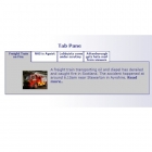
Choose the tab pane style, the options avaialable are: default (horizontal tabs), simple list, vertical tabs, vertical list. This option affects the tab pane layout only.
Colour scheme
Choose the background colours for the module. The choices available are:silver, blue, green, black, dark grey, white, user. The last one is to allow the option for the user to edit the css, though actually any of the styles can be edited. The stylesheets can be found in the module folder 'css/colors'.
Link Images
If set to 'yes', the images are clickable.
Read more link
If set to 'yes', each article includes a clickable 'read more' link.
Read More Text
The text to display for the 'read more' link. This can include html tags such as the <img> tag so that icons can be used instead of text.
Show images
Choose whether to include a thumbnail image along with the article extract.
Max Image size
The maximum size of the image (in pixels).
Image Position
Choose whether to display the image to the left or right of the article.
Use GD
If selected, the GD graphics module is used to resize the image. This is preferable, because it does result in better image quality and smaller download size. However it does require that your PHP installation includes the GD module. If the GD option is not used, the images can still be displayed as thumbnails, but the actual image files will be used, just displayed at a smaller size.
Fixed width and fixed height
These parameters are used to set a fixed width and height in pixels to the pane holding the articles. Usually it is not necessary to set this parameter, as the sizes will adjust automatically, but sometimes layout problems can be avoided by setting this width or height.
Intro Text and Footer Text
Add text here that you wish to display at the head and foot of the module.
Module Class suffix
This is used mainly to set a common style for modules.
Tags
A new feature of the module is that you can optionally display special information about the article inside html comment tags. This information will be read and displayed by the module. However because it is placed inside comment tags these will not be visible when the main article is viewed.
The available display tags are:-
- <!--heading:[ heading goes here]-->
- <!--author:[author goes here]-->
- <!--synopsis:[synopsis goes here]-->
- <!--comment:[comment goes here]-->
- <!--image:[image path goes here]-->
- <!--alt:[alternate text for image]-->
The [ ] and the text inside can be replaced by anything you want. The author tag includes an optional %date placeholder, which will be replaced by the date of the article. It also includes an optional %author placeholder, which replaces this with the name of the user who created the article.
These tags can be used to optionally replace the default information displayed in the module, for example you can specify a different thumbnail image to display using the <!--image:--> tag, and replace the article text using the synopsis tag, giving you great control over the module display.
Older Versions
The 3.x series releases of the module featured compatibility with the Mighty Extensions Resources component. These are the options available.
Mighty Extensions Resources Content Options
Resources Category
The category(s) from which the articles are selected. Use control-click to select more than one item. This applies when the Mighty Extensions resources component is used as the content source only.
Resources Type
The type(s) from which the articles are selected. Use control-click to select more than one item. This applies when the Mighty Extensions resources component is used as the content source only.
Resources Article
The articles (records) that you want to select. Use control-click to select more than one item. This applies when the Mighty Extensions resources component is used as the content source only.
Resources Fields
The fields that you want to select. Use control-click to select more than one item. This is useful when you want to display articles but you don't want all the fields to be displayed in the module. This applies when the Mighty Extensions resources component is used as the content source only.
The module can display text taken from the text, textarea and html field types, and thumbnails taken from the image or picture field types, as well as images embedded in html fields.


